Giallo
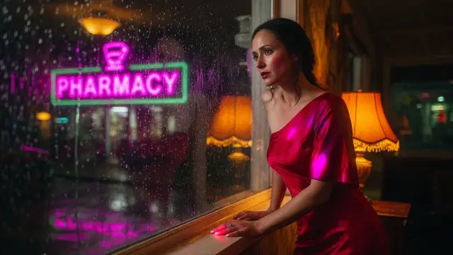
Giallo cinematography is Italian thriller grammar: hyper-saturated primaries from gelled windows and glass, fashion interiors, and a camera that often zooms rather than dollies toward threat. Beauty lighting sits on the victim. The violence is styled, not silver.
Narrative function
Horror here is also wardrobe. A cobalt window, a red hallway, black leather in the foreground.
The frame is chic until the glove enters. Subjective threat is a color, a zoom, and a Dutch Angle, not a wet black alley.
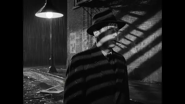
It is the wrong tool for low-key crime or for density-as-ornament. Film Noir withholds with black.
Maximalism fills every zone with pattern for pleasure. Giallo uses primaries as a weapon inside relatively designed, often sparse, interiors.
How it works
Gel the keys: red, green, cobalt through windows or colored glass, so the palette is primary, not pastel. Keep contrast high but chroma higher.
35 Techniscope wides for interiors. Dutch a few degrees on the kill or the stare.
Foreground a black glove, a blade, or a fashion object. Prompt hyper-saturated primaries, implied black leather, Argento color crime, and beauty as the lighting on the face, not a slogan.
When to use it
Use it when a stylish interior has to turn hostile through color, a zoom, and a gloved hand. Do not use it as generic saturated horror or as noir with a red grade.
Compared with similar shots
Giallo is gelled primaries and fashion-threat. Film Noir is unfilled silver.
Hyper-Saturation is a grade; giallo is that grade plus zoom, dutch, and leather-glove blocking. Maximalism packs ornament; giallo often leaves chic negative space and stains it with one violent hue.
Dutch Angle is a tilt. Giallo uses the tilt as one tool among gels and zooms.
In film
Suspiria (1977): colored glass as motivated key, dance-school architecture as a trap. Deep Red: zoomed inserts, primary interiors, investigation as fashion-horror.
Grammar, not frames to copy.
Prompt it
Giallo look on [Subject], hyper-saturated primaries, gelled window key, black leather implied in the foreground, 35mm zoom threat, Argento color crime. Name the red, green, or cobalt source.
Do not prompt a black-and-white alley.
What usually goes wrong
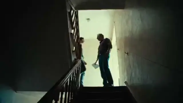
The usual wrong cousin is Film Noir or plain Hyper-Saturation: a fedora night, or a loud grade with no glove, no gelled window, and no zoom. The tell is teal-orange rain or even, pretty color with no threat axis.
Fix: pick one primary as the key, dutch or zoom toward the threat, and put a dark fashion object in the foreground.
Questions
What is Giallo in film?
An Italian mystery-horror look: gelled primary color, fashion interiors, zooms, dutch angles, and stylized violence. The lighting is often glamorous. The threat arrives as a color and a glove.
Giallo vs Film Noir
Noir withholds with black and wet silver streets. Giallo attacks with red, green, and cobalt in designed interiors. Both can dutch the camera. Only giallo treats a window gel as the murder weapon.
When should I use Giallo?
When horror has to look like a fashion spread until the glove enters. Skip it for silver crime, for future neon investigation, or for busy ornament that is not a threat.
How do I prompt Giallo for AI image or video?
Write: Giallo look on [Subject], hyper-saturated primaries, gelled window key, black leather in the foreground, 35mm zoom implied. Name the primary. Do not ask for noir silver or a generic saturated grade.